Tuesday, November 30, 2010

Sally Mann


The image above is one of my favorites of the work at the Sally Mann exhibit. I love the fact that is actually a long exposure of maggots eating the flesh of this deceased individual. I really like the anonymity- you can't tell whether it is a man or a woman. I think that the fact that she used glass plates was amazing. I remember going to the bodies exhibit at the Science Center in Orlando. There were over 200 deceseased bodies dissected and analyzed within the show. It was an amazing experience and reached me as much as this photograh above.

As for the rest of the show, I wasn't thoroughly impressed. I thought that the overall the show lacked that extra bit- the extra piece that ties each of the shows together. I feel that Sally Mann knows how to take pictures and she has amazing ideas, she just doesn't know how to execute each idea to it's fullest potential. Like for the portraits of her children all grown up, they weren't that interesting. They seemed like simple portraits and that's all. Besides that, I will continue to go see her shows because it might have just been a fluke that I didn't like it.

Sally Man - The Flesh and The Spirit

Sally Mann, "Hephaestus," 2008. Gelatin silver print, 15 x 13 1/2 inches

Sally Mann, "Was Ever Love," 2009. Gelatin silver print, 15 x 13 1/2 inches

These were two of my favorite pictures from her series Proud Flesh. This series is particularly powerful, especially these two images, because they deal with the emotional weight and the physical suffering that families endure when someone has a degenerative disease, like muscular dystrophy. The emotional turmoil associated with these images makes them very intimate in a sad and strange way. This series became even more interesting to me once I watched her movie and I heard her say that young photographers should take pictures of things and people that matter to them or they won't make good art and even more so when she said that Larry (her husband) was always willingly to model for her (even with his poor health) and she wasn't sure if it was right to ask him to do so. The vulnerability, affection, and the fragility of life that this series addresses makes these images very powerful and very easy to connect with emotionally.

Detail, Untitled (Self-Portraits)

Ambrotype (unique collodion wet-plate positive on black glass), with sandarac varnish. (15 x 13 ½ in.)

Untitled (What Remains)
Gelatin silver print, 15 x 13 ½ in.

Mortality both scares and interests me, so I really enjoyed Mann's What Remains and Self Portraits because they depict her emotional struggle and fascination with mortality. I feel that Sally Mann has successfully taken the exploration of the vulnerable and fragile state of the human life and body to a level that other artists have failed to achieve. I was also interested in her process, specifically how she used the collodion wet plate process. Mann used the word 'serendipitous' to describe it, because the 'errors' of her negatives made her prints more beautiful and interesting. In the movie, she talked about how fragile the negatives were and how easily they acquired scratches and dust. I felt that the fragility of the process had interesting (and possibly intentional) connections to her focus on mortality. I also thought it was interesting that she hoped she never mastered the process; that these errors only add to the aesthetic of her work.
I also thought it was good planning on her part to include the biographical video at the end of the show because it really made me appreciate and relate to her photos and her struggle a lot more than had I only viewed her photos and read her artist statements. This was a great show and I plan on returning for a longer visit.

Sally Mann
Untitled#7
from the series "Antietam"
2000
gelatin silver print with varnish

Going to the Sally Mann exhibit really opened up my perspective on the kind of stories that documentary/narrative photography could have. I also really appreciated that the museum decided to include some of her early work with her children that made her popular. I thought the study on decomposing bodies was very interesting, as well as the study of her husband after he was diagnosed with his muscle condition. However the work that really interested me was the battle filed series she did in Antietam. This series originated from her witnessing a murder in her own backyard by the police killing a fugitive. She observed the area were the man died and became very interested in documenting landscapes where mass murders occurred. This eventually lead to her series on decomposing bodies.

Alexis Mattila- Sally Mann


I went into Sally Mann's exhibit with fairly little knowledge about her or her work, so I really didn't know what to expect. Prior to the show, I'd seen some of her images and I knew her for being fairly controversial with the subjects she chooses to photograph (ie, her children), so being able to go in and experience the work for myself was an extremely rewarding and enlightening experience.

That being said, I really enjoyed the exhibit. As a series, the body farm images were the most interesting to me. So many artists hold a certain fascination with death; striving to capture the essence of death, the mood of death, the emotions, colors, movements or sounds...well, whatever it is, it's usually represented or portrayed in some conceptual or staged way. But this was the first series of work that I've seen that is literally of death. They were real corpses, actual human remains. Many of the images seemed rather dreamlike, but I couldn't decide if it was a surreal, floating dreamy or a haunting, foreboding dreamy. I think I bounced back and forth between seeing them as both. It was rather intriguing, wondering why Sally Mann chose to go shoot actual corpses. I wonder if she was trying to make some kind of statement about death, or show that even capturing the essence of death cannot create a stronger vision than an image of death itself. I'm curious about if that's true.

Something else that I found interesting:


When I saw this piece in the exhibit (left), I immediately thought of Christian Boltanski's work (right). They're not super similar, but i suppose the two kind of give me similar feelings when looking at them; how they both seem to create this essence of longing a lost identity or the faces from a distant memory, forever captured in our minds as nothing more than blurry faces that are remembered for being forgotten.
(image on right: Monument Canada, 1988, by Christian Boltanski)

Mel Kobran- Sally Mann Exhibit


In Sally Mann’s exhibit, “The Flesh and The Spirit,” I was really interested in her utilization of many different types of photographs that still functioned to create a show that had a cohesive theme and sense of chronology.

This photo (Untitled) of the decomposing face is one of my favorites of the exhibit. The long exposure needed to produce the image allows the motion blur of the maggots on the face to create an ephemeral haze that makes what is an upsetting and gruesome subject very dreamlike and surreal. This quality is enhanced by the strong contrast in the photo that highlights the decomposing nature of the corpse, but in such a way that increases my fascination rather than my disgust. For similar reasons, the first image of the corpse’s full body really stood out to me. The quality of light in Sally Mann’s photos has this remarkable quality of being stark yet translucently delicate simultaneously. It is this hazy nature, in combination with the imperfections in he large format processing and printing, which make her work so impressive.

Elyse Smith- Sally Mann Show


I loved going to see the Sally Mann show. It was great to be able to really see her work, not just in a book or on the computer. I loved all of her images, but I think the one that surprised me the most was a photograph of a male corpse. I was very nervous to see the images from the “body farm” because I have a very sensitive stomach. Before going to the show I didn’t know if I would be able to handle those images. While there were some that were a little too much for me, I was able to really appreciate the beauty in most of them. This one in particular I really couldn’t stop looking at. I don’t know what it was about this one photo, but I spent a long time in front of this particular image. I don’t know if beautiful is the word, but I was truly captivated by this image. I think that this is one of the images that was memorable because I was so surprised by my reaction. I knew that I would love seeing her work, but I didn’t expect to be so fascinated by the images of the dead bodies. I guess I could say that I was pleasantly surprised by this reaction. I am glad I was able to appreciate that part of the exhibit and not have to walk out. Not only was I able to handle the images, there were a couple that I really reacted to.

Glenn Jodun - Sally Mann Favorite Photo

Proud Flesh, Amor Revealed.  Sally Mann.  2007.
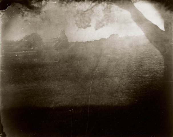
My favorite photograph from Mann's exhibit was Proud Flesh, Amor Revealed.  I enjoyed her use of depth of field, as well as the exploration of her husband as a model in her work.  The other aspect of her work that I liked was her creation of her own negatives through ambrotypes, creating one of a kind images with different emulsion streaks and cracks in the glass.

Sally Mann Favorites- Adriana Rossi


Virginia #42 and Hephaestus were my two choices of the many favorites I saw at the Sally Mann exhibit. What drew me to the portrait of Virginia, was the blissful yet somber way her eyes are closed so sweetly. It looks like a delicate moment in the child's mind weither she is really dreaming or not. The soft focus and extreme upcloseness adds to the concept and really makes this photo what it is. I saw this photo is a gallery a couple of years ago, and still enjoy observing every freakle on her gentle little face.
Hephaestus is an equally strong photo and has a quite powerful impact when viewing it in person. I watched part of the video of Sally Mann at the end of the exhibit, and she said something along the lines of "I hope for a mistake. Those mistakes are my blessings." I think Hephaestus is a good example of the way the process really enhances the work. The circular marks add to the composition and are really intriguing because they look as if the man has caught some sort of dieases. The fact that his head is cropped out of the frame also adds to the fact that he seems to be objectifiyed and used as a prop in this piece. Hephaestus was a mystical powerful greek god, and this photo depicts a sick looking man; I find that ironic. Anyway, its a haunting photo.
Overall I enjoyed the exhibit and liked seeing somethings I haven't of hers. The self-protrait was really neat and the room full of figure studies which I think was called Matter Lost was very successful. It was a series of objects, flowers, and human legs underwater which I thought were very interesting and dreamlike, especially because my sense of scale was thrown off when looking at them. The flowers were very up close, while the legs further away leaving me wondering if it were a different layer on top of the original photo, or if the flower was really on top of the water, while the child's legs just at a greater distance. Sucessfully confusing. The only thing that bothered me in the exhibit was the color photos of the dead people. Not because they were in color, but because they seemed slightly obnoxious to me for other reasons. Something about the distance and the context that they were placed in seemed like she was just glorifying the fact that they are dead people, rather than a poetic study of their remains. In my opinion, the rest of the series which was in black and white, was more successful in regards to concept.

Sunday, November 21, 2010

Mike Weinheimer-Sally Mann Favorite


Untitled (self portrait)
2006-2007


Was Ever Love
2009


Hephaestus
2008


Emmett #3
2004


My favorite Sally Mann photographs is her self portrait that is six across and 3 down, Was Ever Love, Hephaestus, and Emmett #3. The use of the ambrotype process for her photographs is very successful and gives each an unusual feeling and appearance. Her angling and frame use is very interesting in the way how it portrays masculinity from a female on a nude male. Also how it veers from traditional viewing of masculinity. It is interesting to see how her self portrait does not appear to be the same person due to the process of which the prints went through and the difference in angles, print quality, and tonal range of each print.


Friday, November 5, 2010

Alicia Helm Second Blog Assignment

Smoke and Veil, Paris Vogue, 1958

Bold
Broadway and 103rd St., New York 1954

William Klein
William Klein is best known for his fashion and journalistic portraiture. He trained as a painter but after an exhibition in Milan with his kinetic sculptures, Alexander Liberman, then art director of Vogue hired him. He is able to create powerful images using shallow shots and tension within the photograph. This tension doesn't necessarily stem from the tension of what the subjects are doing. By trying to squeeze the most into the frame, he can equilibrate the balance of subject and abstract tension.


Marcel Duchamp

Salvador Dali

Irving Penn
Irving Penn is one of the century's most influential fashion photographers. He worked for Vogue in 1953- a remarkable time for the growth of American fashion. He was not primarily a fashion photographer. He shot still lifes and pictures of food saying once that "photographing cake can be art too." He graduated from the Philadelphia University of the Arts in 1938. He passed away last year, yet his legacy lives on in the modern fashion photographer's heart. The two pictures above show a different technique he possessed. Using a narrow triangle as the background forced the subject out of the frame making them seem more 3-dimensional.


The Beatles
April 18th 1963
Twist and Shout (album cover)

The Beatles

Fiona Adams
Fiona Adams studied photography at Ealing School of Art. She went through several phases of photography before landing her claim to fame photographing the Beatles (little known at the time) outside London for Boyfriend Magazine. The photograph on top made the album cover for the album Twist and Shout. The most interesting thing about her is the innovative quality of the shot. She didn't stick to the traditional studio-posed shot (like the first shot below). My favorite part of the story is imagining her cramming into a taxi with her equipment and the four Beatles. After this, she started photographing other icons of the 1960s like Jimi Hendrix and Twiggy.


Andy Warhol
Painter, Printmaker, The Factory, New York
1973
Leonard Bernstein
Philharmoic Hall, New York
1968
Arnold Newman

Arnold Newman spent two years at University of Miami studying painting and drawing before leaving because of finanical troubles. He then moved to Pennsylvania and worked at a print shop. This started his journey into the world of photography. He photographed celebrities and personalities such as Marilyn Monroe, Andy Warhol (pictured above), and Ronald Reagan. Although he photographed all of these people, their fame did not matter to him. His ideology was to photograph with intention- the composition was the key element that spoke to the viewer whether the subject was famous or not. I like his work because I agree with his ideas completely. He can make the most average person look important just by using his eyes and composing them as such.


Thursday, November 4, 2010


"Henry" by Olivier Laude


"Yossef's Buck" by Olivier Laude

Laude is, surprisingly, by profession a freelance graphic designer. However, on his site you are immediately taken to a gallery of 37 images, including the ones I posted above. In contrast to his serious graphic design work, these portraits, which include many of the same models as different characters (as you can see, "Yossef" and "Henry" are quite obviously the same person) are hilarious, beautiful, and mildly creepy at the same time. I'm not quite sure what Laude was going for with these portraits, but I think they are hysterical, which is something I don't always appreciate in artwork.


"Dermit, Kilkeny, Ireland" (2007) by Geordie Wood


"Pamela Chen, Newport, RI" (2007) by Geordie Wood

Geordie Wood works in fashion and sort of journalistic portraiture. A lot of Wood's portraits that I found were taken for magazines and other commissioned jobs, but it still seems very apparent that he considers each photograph that he presents a work of art, even if it is for a job he's hired to do. The image titled "Pamela Chen, Newport, RI" is probably my favorite of his. The simple silhouette in contrast to the rich textures in the floor and curtains is haunting and beautiful. I'd definitely recommend looking at more of Geordie Wood's work.


"untitled" (2004) by Tierney Gearon


"Untitled" (2004) by Tierney Gearon

Both of the above photographs are from Tierney Gearon's "The Mother Project". This series is a conglomeration of uncomfortable, sad, and beautiful photographs of her family members and herself. Tierney works under the belief that all of her photographs are of herself.


37 PAINTING (HYGIEIA, THE GODDESS OF HEALTH, BY KLIMT), 2007-2010


“The Bride with a Nô Mask, Self-portrait” (2005) by Kimiko Yoshida.


“I take my makeup from the Japanese technique of doran, the white paint with which geishas and maïkos traditionally cover their faces,” Yoshida writes. “Doran tends only to erase the singular face, to dissimulate it by covering it with white, to remove any particularities.”

I love the way Yoshida incorporates the idea of doran make-up techniques erasing any unique qualities of the face. This is an interesting idea to me, considering portraits usually fit the fact that human facial features are so unique to each and every one of us.

The top portrait is from a series of self-portraits that interpret or recreate famous works of art. I recommend checking out the whole series, she created very interesting costumes/masks for all of them.

Wednesday, November 3, 2010

Micki Multer Blog Assignment #2


Dabe Alan's Website
Dabe Alan is a commercial photographer that I found and instantly fell in love with. I enjoy his sense of humor that he conveys, and the feel of the photos are nice. I would like to expand and be more creative with my subjects and their backgrounds like he uses.


Phil Nesmith's Website
Phil Nesmith is a friend and photographer I look up to. I am always captivated by his ambrotypes. These two are from his show "Flow" which was is 3rd solo show at the Irvine Contemporary. To me the way he takes the pictures which not being digital or film amazes me and gives a really creepy feeling to them, I feel they convey so much more then if the same was done in one of the usual media's of art.


Caroline Olson's Website
Caroline Olson is a photographer that I enjoy and watch regularly. I love her use of photoshop when editing, to me you can tell it's been used but it feels right and not overdone. She shoots just about anything, from weddings to family portraits to pictures of her son. I enjoy looking at it all. Out of these two the top one I love because its showing you what that person does.


Tuesday, November 2, 2010

Sam Norwood
Blog 2

Bruce Wilson

Found on www.bestuphotographers.com

His website is http://www.brucewilson.com/portfolio.html

Bruce Wilson does a variety of portraiture and commercial photography. The composition, lighting, and color in his works are obviously thought out and achieved well. He utilizes space in most of his pieces to create well balanced images. You can tell he has good communication with his subjects based on their posture and expression, and I feel like this is something I need to work on more.


Ann Brown

Found on www.bestuphotographers.com

Her website is http://www.annbrownphotography.com/newsite/newsitemisc/menuset.html

Brown ranges from commercial photography to experimental photography. I find her costumes and sets very interesting. She is also a makeup artist, and uses this experience in a lot of her work. I feel like I might be more attracted to this because I’ve done work as a makeup artist and would like to experiment incorporating that into my photography. The lighting in her work is very complimentary to the people in it and they are all decently balanced.


Filippo Ioco

Found on http://www.foliolink.com/fl4a.asp

http://iocobodyart.com/Artist.asp?ArtistID=6122&Akey=ACRTB3M7

Ioco’s art is very conceptual. It emphasizes the nature of the human body and distorts reality using surrealistic perspective and messages behind the image. Much of the relationship between the body and nature stems from placement and representation of color and pose.

Michael Hartman

Found at http://www.foliolink.com/fl4a.asp

His website is http://www.michaelroberthartman.com/gallery.php?cat_id=14

Hartman’s art places a lot of emphasis on beauty. He tends to take a very formalist approach with composition and lighting, but manages to abstract it with his overall style. His ideas generally center around being aesthetically pleasing. I feel as though a lot of my photography is generally abstract in some ways and I should work on formalist techniques and technicalities. I feel as if Hartman is a good example of the combination of these ideas.