From
DIYPhotography -
Patterned Photographs of Computer and Glass
This particular entry featured an interesting idea for a rainy weekend project. The photographer/blogger Steve Hermitage set out to play with patterns and glass, specifically glass that bends light in interesting ways. Basically, the project entails the creation of a simple pattern (though I believe a complex pattern may yield just as great or even better result) on your computer and then placing a glass, in this case a wine glass, in front to photograph through. DIYPhotography only posted two examples of the project; however, Hermitage also included a Youtube tutorial of sorts to further elaborate on his process.
From BOOOOOOOM -
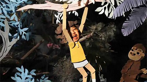
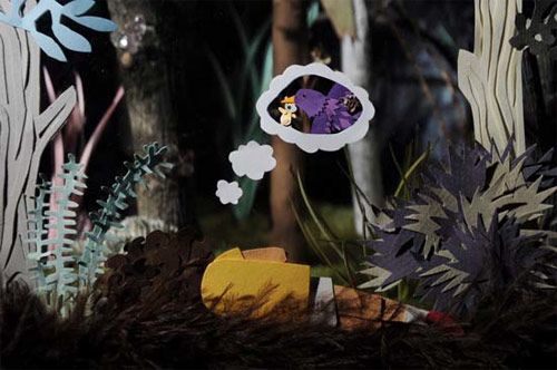
You Were In My Dream
This post by
Jeff on BO...OM, comments on his experience with a project known as "You Were In My Dream." The project by
Isobel Knowles and
Van Sowerwine
takes a live video feed of the viewer's face and incorporates it into a stop-motion Utopian world that relies heavily on survival of the fittest. The piece was created at the bequest of Experimenta with the theme of "Utopia" and seeks to showcase the adaptation and evolution of a species directly correlates to its survival, incorporating a world untouched by industrialization.
From
State of the Art -
Library of Congress Duplication Services
 |
| President Abrham Lincoln. January 8, 1864. Gelatin Print. Mathew B. Brady. |
For about $40, you can now have 8x10 reprints made of photographs by the Department of Duplication Services at the Library of Congress. The Library holds a huge store of photographs to choose from, the examples from the blog included Matthew Brady and Walker Evans though there are many more; however, it is important to note that the selection is limited by each photograph's individual copyright. Also, prices are subject to the size of the print and the quality of the paper being used.
This blog posting only had one photo listed, but went ahead and found an example of Walker Evan's work to show:
 |
| Portrait of James Aghee. 1937. Photographic print. Walker Evans. |
For more information on requesting prints:
Department of Duplication Services
From
The Online Photographer -
Canon S95 Review
 |
| The S95. 2010. Edward Taylor. |
 |
| Barcelona harbor. 2010. Drew Taylor. Shot with S95. |
|
The author of this blog is like most of us, or I'm assuming that, in that being college photographer we have probably become snobs to point and shoots over more professional DSLRs and such. What starts as the author's shopping for a birthday present for his son quickly turns into a positive testimonial on one of Canon's newest point and shoots. The camera itself is lightweight, complete with full-auto and manual controls, capable of shooting in RAW and JPG formats, and a resolution of ten mega pixels for about $400.00. The author seemed quite pleased with the quality of the camera with its quality of prints being great for sizes under 16x20, the overall build of the camera, and its responsiveness - going as far as to say that he carries it over his more "professional" cameras unless the shoot's of a more important nature.
From
Conscientious -
In behalf of the men who will never get out
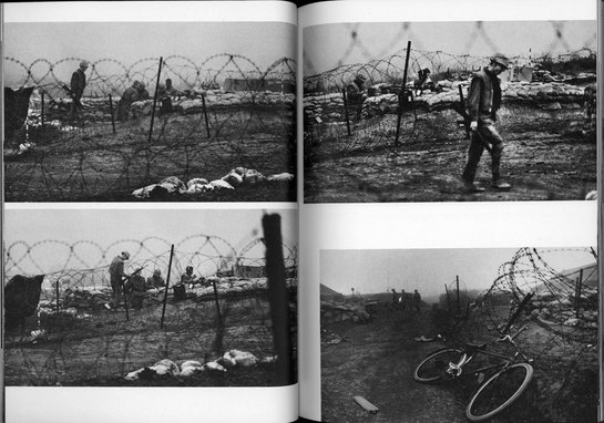 |
| Photographs from the Vietnam War. David Duncan. |
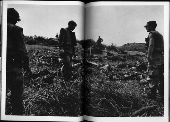 |
| Photographs from the Vietnam War. David Duncan. |
This post by Joerl Colberg is about how he and his wife, two estate sellers, come across a book of photography by the combat photographer David Duncan that they bought for all of five dollars. The book, entitled I Protest!, seeks to inform the American people about the harsh cruelties of war and its painful reality - depicting images of mounds of war dead, the product of much devastation. The author goes to question the content of the photographs, to question the Vietnam war, and goes on to draw a possible parallel to the Afghanistan; but the most important conclusion he comes to is how combat photography is approached today. It's sterile, clean - visions of the enemy's dead, as well as our own, have ceased to be taken.
From Beyond Mega Pixels -
Five Tips for a Better Portfolio
 |
| Untitled. 2010. Tiffany Joyce. |
 |
| Untitled. 2010. Tiffany Joyce. |
This entry offers advice on how to improve your portfolio. Joyce starts with the presentation of a portfolio online, and recommends finding an alternate means to publishing your portfolio as opposed to Flickr or Shutterfly. Instead, it would be better suited to either create your own website or make use of a blog through WordPress or Blogger - both of which offer templates specifically for photographs. Her second recommendation is to keep adding content, but also makes use of the quality versus quantity axiom. Furthermore, as you progress in your talents it's a good idea to take down older things as they begin to lose their luster. The third step is to look for gaps in your photography, meaning the portfolio needs to be balanced. You shouldn't have too many portraits, too many landscapes, and so on and so forth. However, in step four, it is explained that if you have a specialty then by all means create a dedicated portfolio website around it to attract such clients, but also be aware of other clients and their needs and perhaps have a smaller portfolio site designed just for them as well. The fifth and final tip is get feedback before ever posting the portfolio. You'll want to know what friends, family, classmates, and so on think honestly before throwing your portfolio to the rest of the world. That way, if something just isn't working, you can fix it before future clients pass judgment on a simple mistake.
Just as an added bonus, I wanted to share a particularly interesting blog entry I found on my own.
From
An Open Ended Course in Photography -
How To: Make Redscale Film
 |
| Untitled. Kelly Hoffman. 2007. |
First of all, redscale is when the wrong side of a negative is exposed. It's my understanding that the normal way of exposing and processing a color negative works by capturing blue light first and working down the color spectrum. Redscale works in reverse - exposing the reds first, which due to the property of the light and the film causes the rest of the colors to have a red color cast as well as appearing slightly muted. In order to create redscale film, you first of all have to be in a ligh-tight room. You sacrifice one roll of film by pulling the film out by the leader gently and then cutting it a few inches away from the end. Next with a new roll of film, you start by cutting the leader off and affixing it the opposite way to the other negative with a piece of clear tape. Then with a pair of scissors you rewind the film on to the first sacrificed roll. The final step is to cut the redscale film away from it's original container and cut a new leader. Then you're all set to use it, though it is important to note that the film will need to be overexposed 1-2 stops to obtain a correct exposure.


No comments:
Post a Comment